PROPORTION
This session focused on proportion and scale, studying mostly simple sitting and standing poses we used charcoal as a medium to use line to establish the basic shape of the figure. Straight lines allowed me to describe basic angles in the shape found by using a pencil in front of the eye-line. Measuring the length of the head with my pencil and thumb, I could work out the length of the whole body, and also mark off the sections that make it up. From here it was much easier to fill in the more subtle shapes within the body. At first I found that I pressed down too hard with the charcoal leaving thick, dark lines that were hard to subtly correct. By using lighter marks I could adjust the angles and shapes as I looked for longer to achieve more accuracy.
TONE
This session I was not allowed to use line at all to describe the body; instead I had to use just tone to build up the figure. I experimented with using the side of the charcoal stick to cover large areas of light shadow, using my fingers to work the charcoal into the paper. Trying to draw in the dark shadows behind the figure produced an 'edge' of highlighted tone where the light was hitting the body, which made the drawing appear more 3D. I enjoyed this session more, as I personally see tone to build up shape as opposed to line.
In these two drawings I covered my A1 sheets in a thin layer of charcoal by rubbing it into the paper, then using a putty rubber I could highlight areas of light on the body and with charcoal draw into areas of shade. I found this method very effective in producing a more 3D looking figure, especially when using more dramatic lighting in the studio.
CLAY MODELLING
In the first half of the day I modelled the full body of the figure. Working quickly and moving around 360˚ I had to keep adjusting my model to be accurate to my new view. The purpose of this exercise was more proportion and shape orientated so I focused on those aspects. In order to work as quickly as possible I didn't use any tools to construct or shape this figure I just used my hands to work the clay so little detail was achieved.
In the second half of the day I moulded a model of a head. I created a bulbous shape out of newspaper and attached it to the top of a wooden block stand which would become a base for me to work off of. I spent a lot of time thinking about the very basic shape of the head, again moving around 360˚ quickly I would keep adjusting it to be more accurate. Once I felt I had established a basic head shape I began to add and take away clay to build up the chin, the jaw, the forehead, the eye sockets and the nose, only on a very basic level. The later additions such as lips, eyelids and eyeballs, nostrils, and ears began to build up more of a detailed picture of the head. I used clay tools to cut out folds in the skin and deeper facial crevices. I found clay modelling to be very rewarding after a long day of standing up, just a shame we didn't get to keep them!
 |
| R.I.P clay model. |
COLOUR
Looking at describing the tones of the skin with amplified colours, the first thing I learnt was choosing a colour palette to work from. This means your highlights, mid-tones and shadows are in the same colours so that the drawing has some uniformity and the colours have more impact working together on the page. I used a selection of pastels and chalks which could be blended together softly in some areas which proved to be a more successful way of using colour. This use of bright colour made it easier for me to describe what I was seeing in the skin tones on an exaggerated scale - these were my favourite drawings to do overall as the inaccurate, exaggerated colours gave me the freedom to draw in a looser manner.
iPAD
Using an iPad for the first time to draw was a huge change to other mediums I had previously used. I experimented with different brush stroke settings, colour and backgrounds, finding I preferred to use a very low opacity 'airbrush' effect to build of subtle colourings in the flesh. My main problem with iPad drawing is that personally, I find that I would need a lot longer drawing time to produce a drawing that felt finished, but for me I would like to pursue this result as I did enjoy using the iPads a lot!
FORESHORTENING
This was a very complicated pose in terms of proportion from my angle. I focused on getting the correct shape from my viewpoint for 80% of the overall drawing time, which is why lots of the tone and detail is still missing. Emphasis was placed on correcting the drawing as you looked longer, using a pencil as a guide for size and angles. This drawing was the most frustrating one I did, getting the angles to be accurate proved to be very difficult even when blocking out shapes. In review of my end result I still feel the wrist looks as if a bus has driven over it as it bends over the chest, and the shoulder and neck need to be adjusted.
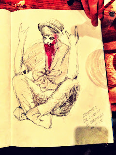
DR. SKETCHY
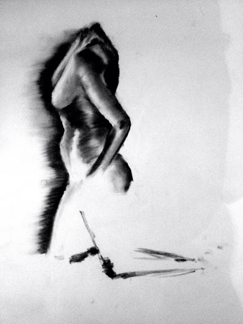
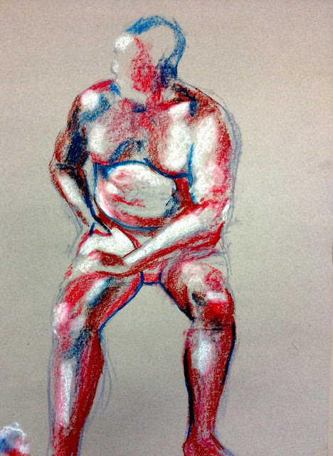
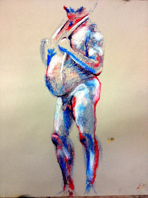
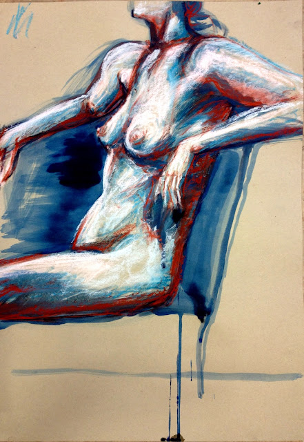
Here are my drawings from a local alternative life drawing class.
Pin It









No comments:
Post a Comment