During my time in textiles I learnt about the various techniques involved in textile and surface design, alternative methods of generating marks and ideas for design and the products that are encompassed by this subject.
I explored mark making by drawing objects blind, or by glancing only briefly and then only at the paper, or by looking only at the object, using an opposite hand to encourage 'looking' and also drawing the negative space around an object. These first drawings are the outcome of those studies:
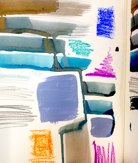
I also looked at colour and created some samples with inks, paints and pastels
I was dissatisfied with using the limited colours from these schemes so I decided on an alternative method of selecting colour. The same way Mary Katrantzou selectively used photography and digital imagery to create her colour palettes I arranged objects in my house into colour schemes - for example the objects in the shower of a similar tone, and photographed them. I then shredded the image and reorganised the pieces leaving only colour and texture, but no original form of the objects.
Here are the original photographs:
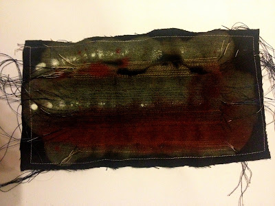
After shredding them I stuck them onto card and added texture by sewing onto the paper, painting on with inks and acrylic, and drawing the negative space of one of the objects photographed to add to the composition of each design. I also did a textile piece made from an old scrap, by sewing onto it, bleaching it and dripping ink on top it has created some interesting results.
Mary Katrrantzou
Born in Athens, Mary Katrantzou moved to the United States to study Architecture at Rhode Island School of Design, she then transferred to Central Saint Martins where she completed her Bachelors and Masters degree. After she completed her Bachelors degree based on interior prints she then switched to fashion print for her MA. When she left CSM she launched her own brand, with full sponsorship by Newgen. Her first collection was shown in 2008 at London Fashion Week.
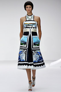
I find her use of print groundbreaking and exquisite. The quality of the images and the fabrics she uses create a luxurious surface, and all of the colours are harmonious throughout each of her collections. Each collection has a theme, such as interiors, flowers, pencils, typewriters, outdated currency and postage stamps. Whilst sticking to the same theme of print she stays ahead of critical speculation by cleverly changing the shape and cut of each collection to give the print a different feel. She calls her work"Painting with pixels".
Pin It









No comments:
Post a Comment